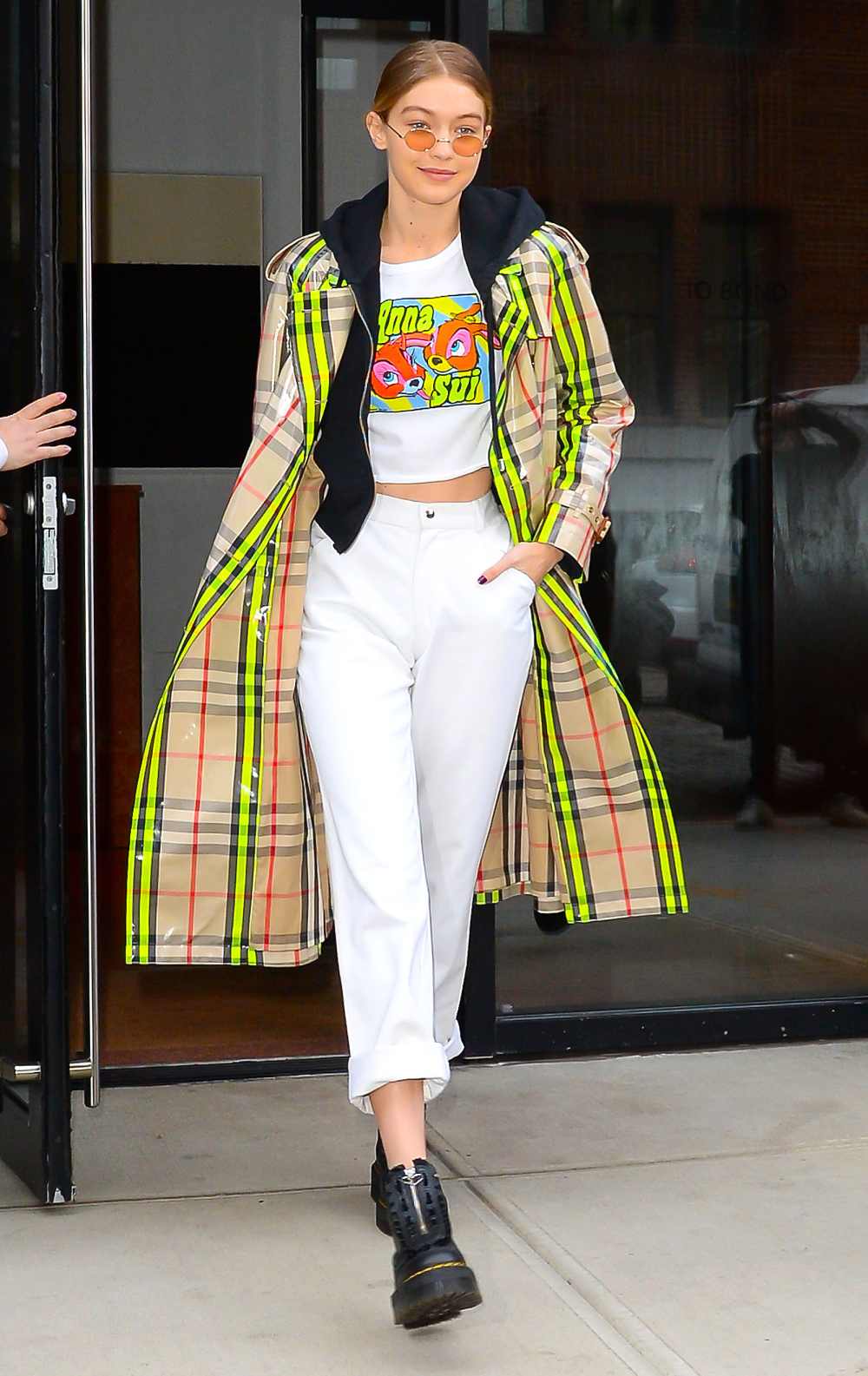
It’s a new day for iconic British fashion house Burberry. The London-based brand (which counts Hollywood royalty like Gigi Hadid, Cara Delevingne and Emma Watson and literal royalty like Meghan Markle and Kate Middleton as fans) debuted a new logo on Thursday, August 2. The brainchild of Burberry’s recently-named chief creative officer Ricardo Tisci, it’s the line’s first logo update in nearly 20 years.
Opting for a much more minimalist design, Tisci (who was most recently responsible for turning French fashion house Givenchy into a brand favored by celebs like Kim Kardashian) debuted the streamlined “Burberry London England” logo on Instagram along with a new monogram that serves as an ode to the house’s founder, Thomas Burberry. The new black and white font is much starker and more graphic than the previous design, while the tan and red interlocking motif is a departure from the classic plaid the brand is known for.
Tisci worked with British graphic designer Peter Saville to create the new imagery, and, based on photos of emails between the two discussing the project, Tisci drew inspiration from the Burberry archives — specifically a logo from 1908. These logo changes are the first for the brand in nearly two decades. Back in 1999, Burberry dropped an “s” from its name, going from Burberrys to Burberry.
The new motifs will appear across all of the brand’s media channels and will make their runway debut next month when Tisci presents his first collection (Spring-Summer 2019) during London Fashion Week. And for those of Us who love the storied house’s iconic check, don’t fret. According to WWD, the new “TB” pattern is not replacing the traditional plaid but rather running alongside it. Cheers to that!

